Aeterra's original site lacked clarity, polish, and brand alignment. Technical sustainability content felt dense and hard to navigate. They needed a site that felt premium, approachable, and built to grow.
Lead Visual Designer, working solo on the full redesign from wireframes through dev handoff.
- Built a modular design system to keep the brand consistent and scalable
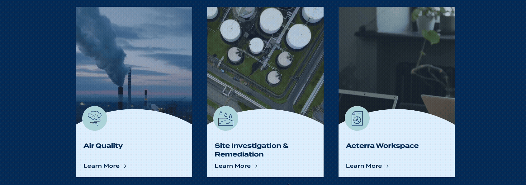
- Clear, scannable layout that improved information delivery and user flow
- Organized content for better scannability and user flow
- Partnered with development for a clean, spec-ready handoff
- Audited the original site to identify where clarity and brand alignment broke down
- Designed wireframes to establish layout logic before any visual polish
- Built a component library covering typography, color, spacing, and interaction patterns
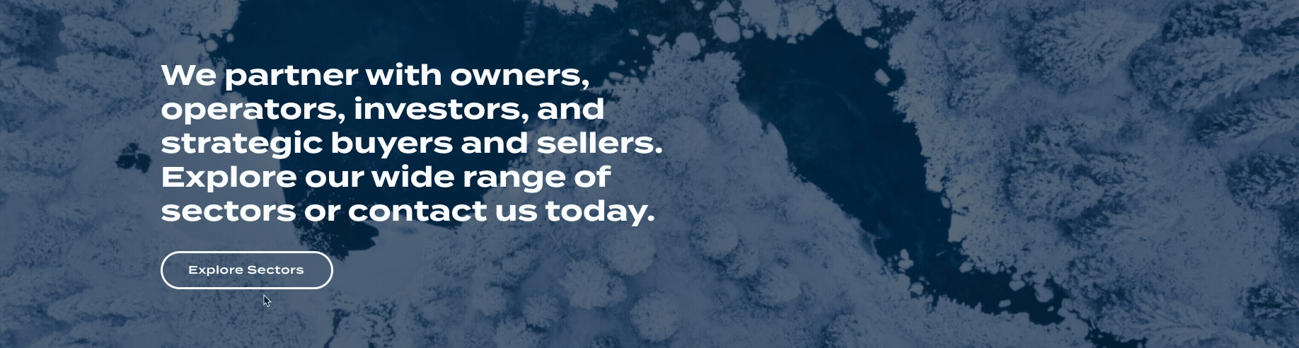
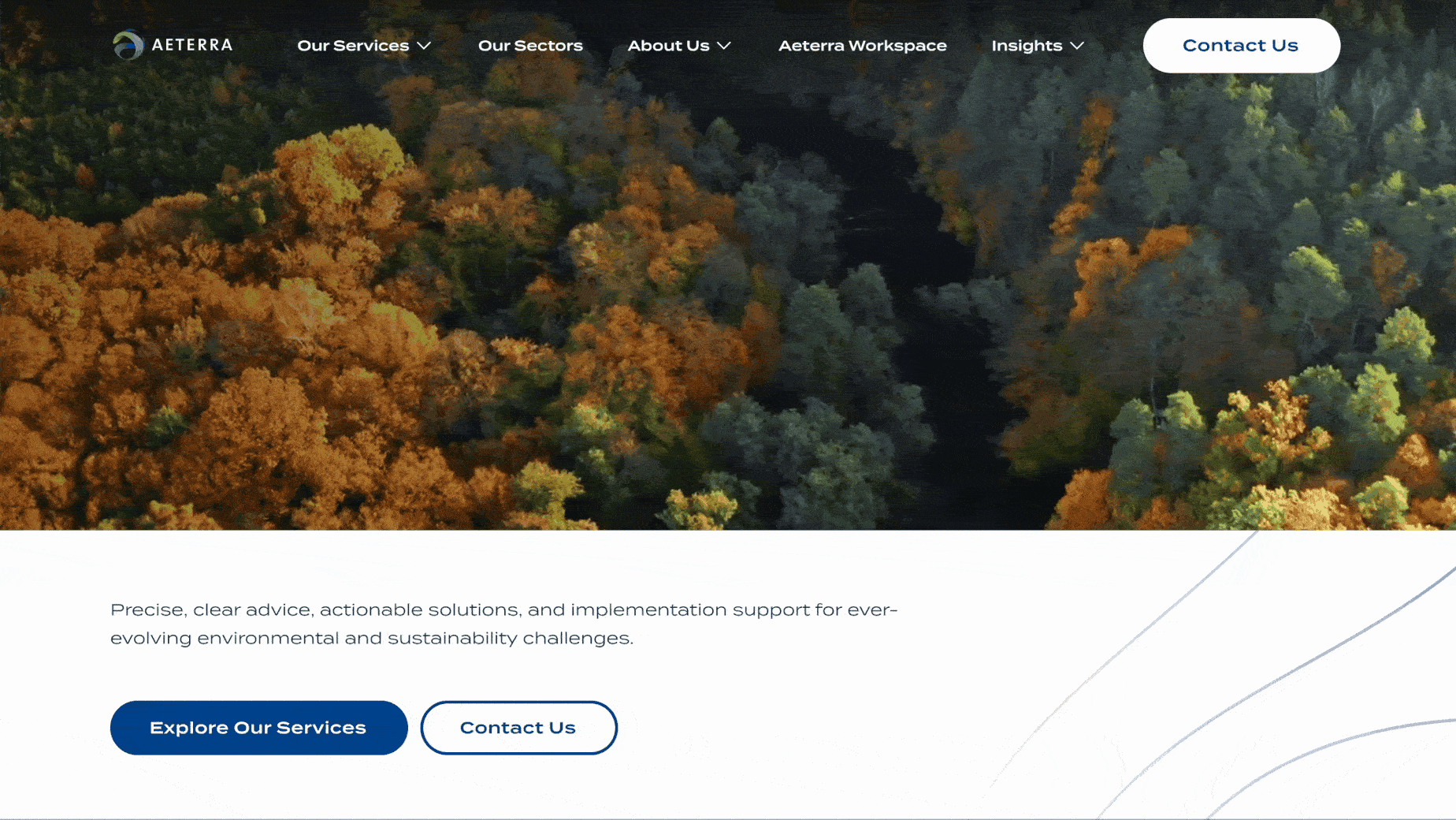
- Used aerial and nature-inspired imagery to elevate the brand tone without overcomplicating the UI
The Results
- Live site that successfully communicates Aeterra's mission and services
- Modular design system built to scale with future brand needs
- Positive stakeholder feedback on the simplicity, elegance, and functionality
- Clean dev handoff with zero back-and-forth on implementation
Collaborative exploration of pain points and Clients Old Site


Full-Page Designs


.gif)